Palan - Packaging Design
A packaging design project shaped around shelf presence, hierarchy, material impression, and distinct brand recall.
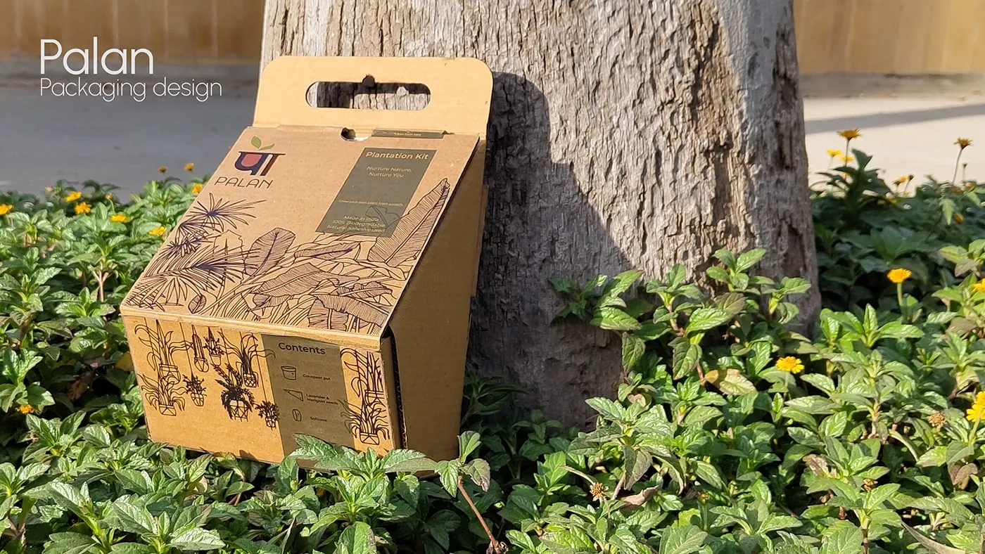
Packaging structure, visual hierarchy, shelf presence, brand presentation
Packaging has to perform in seconds. It needs to communicate category, quality, and brand recall while still working as a physical object on a shelf.
“Good packaging is not just a wrapper. It is a small, structured argument for why the product should be picked up.”
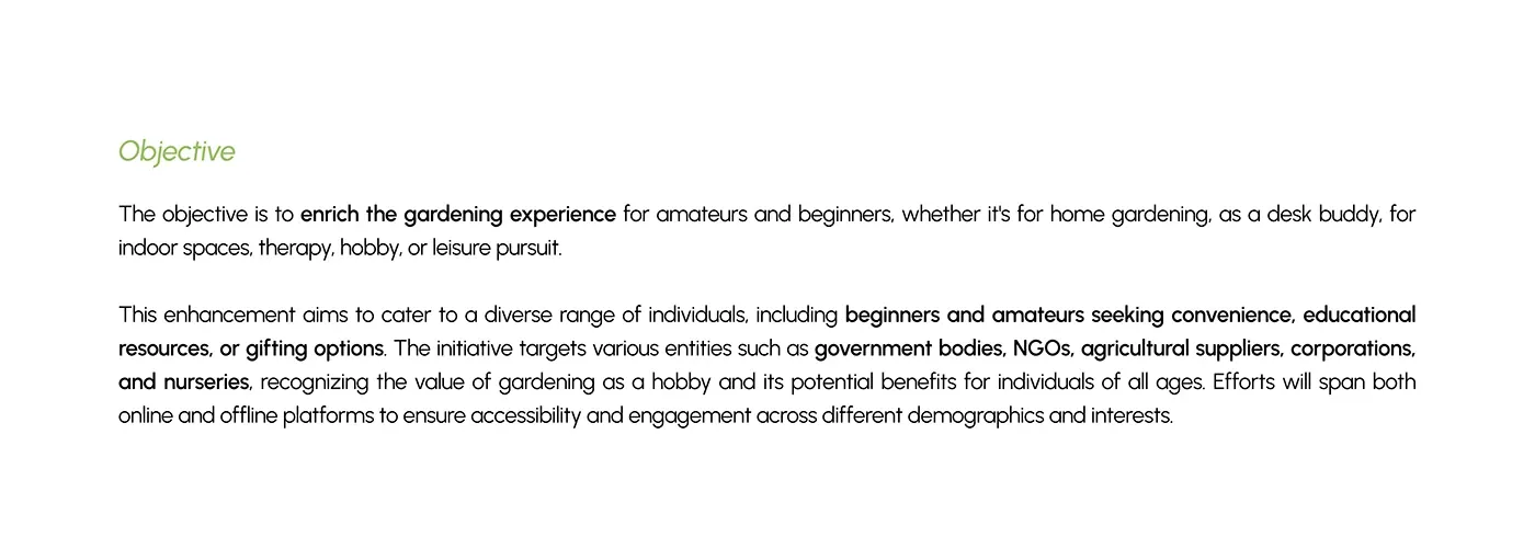
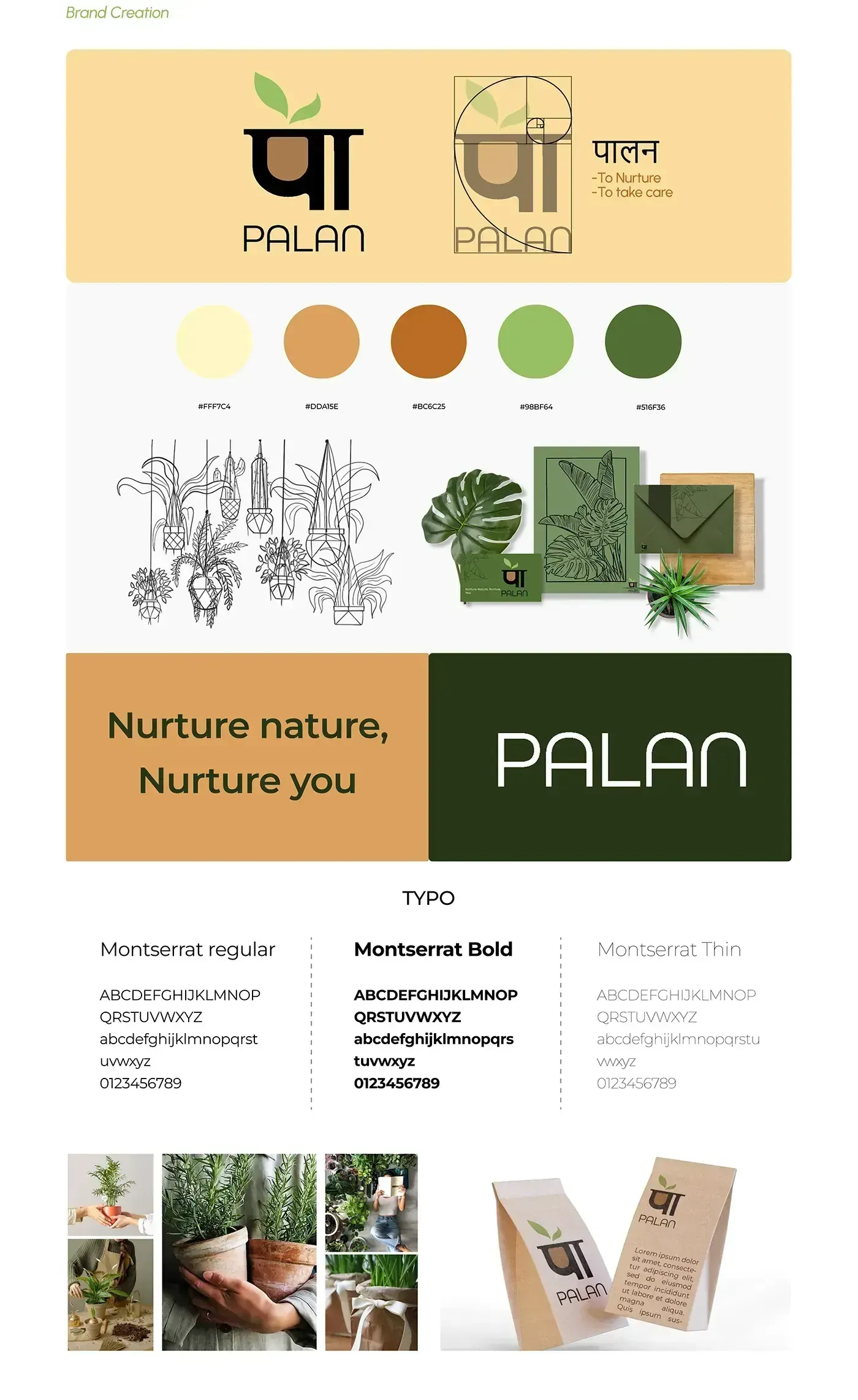
Built the packaging direction around hierarchy, material impression, shelf visibility, and brand memory.
Balanced visual identity with practical readability across surfaces and viewing distances.
Presented the system through controlled mockups and packaging-led visual communication.
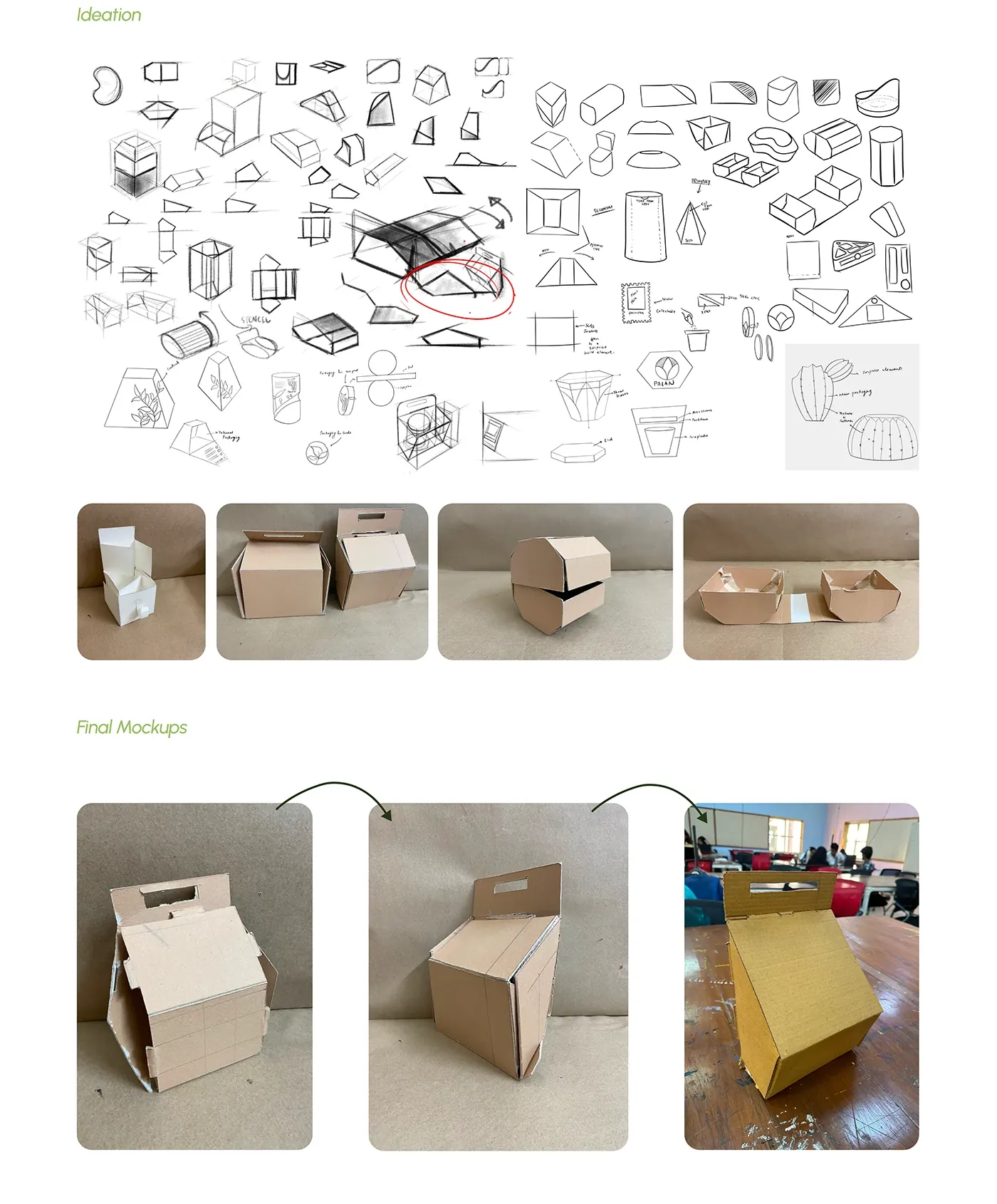
The visual hierarchy was designed to make the product recognisable quickly.
Packaging choices support perceived quality and tactile expectation.
The system uses distinct visual cues that can survive repeated packaging applications.
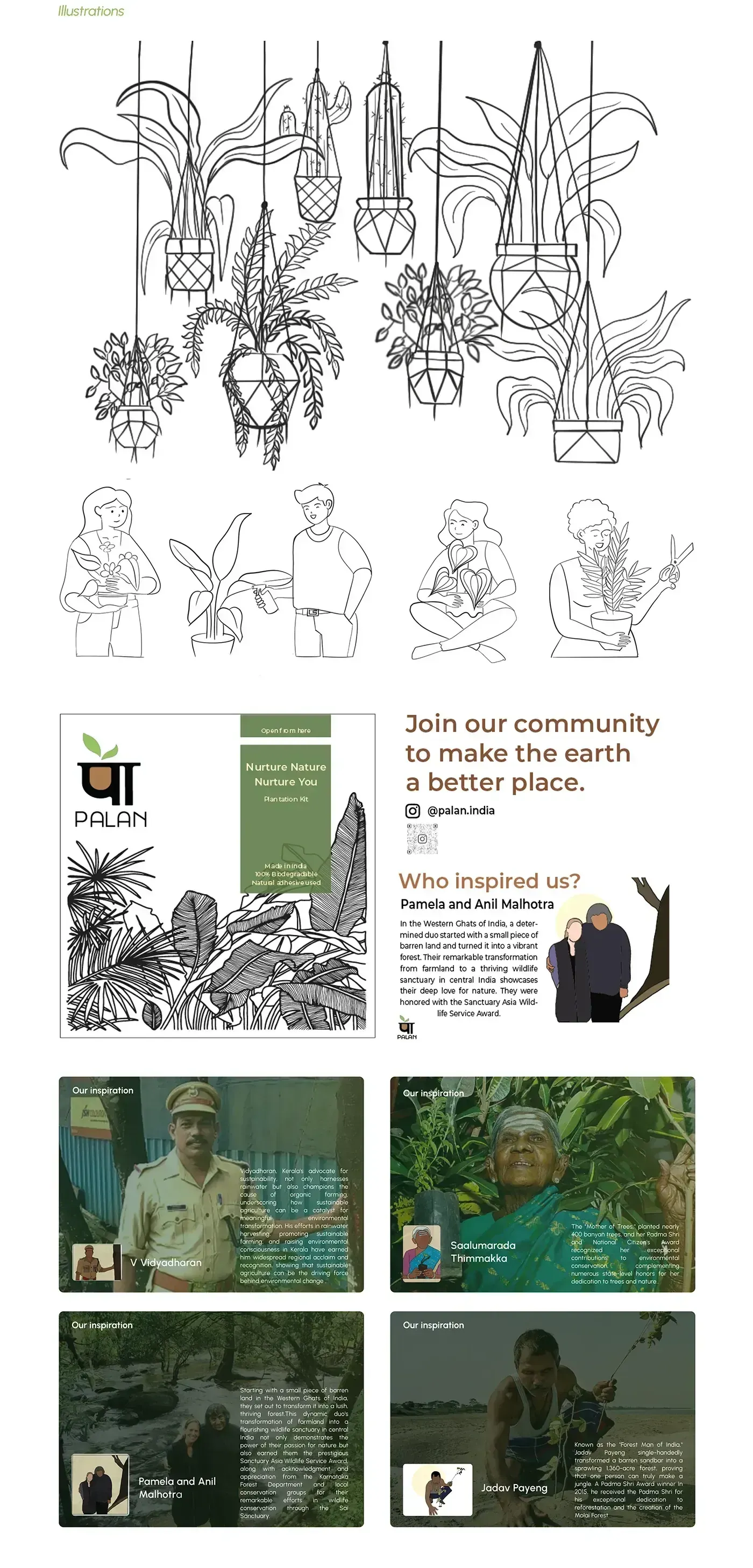
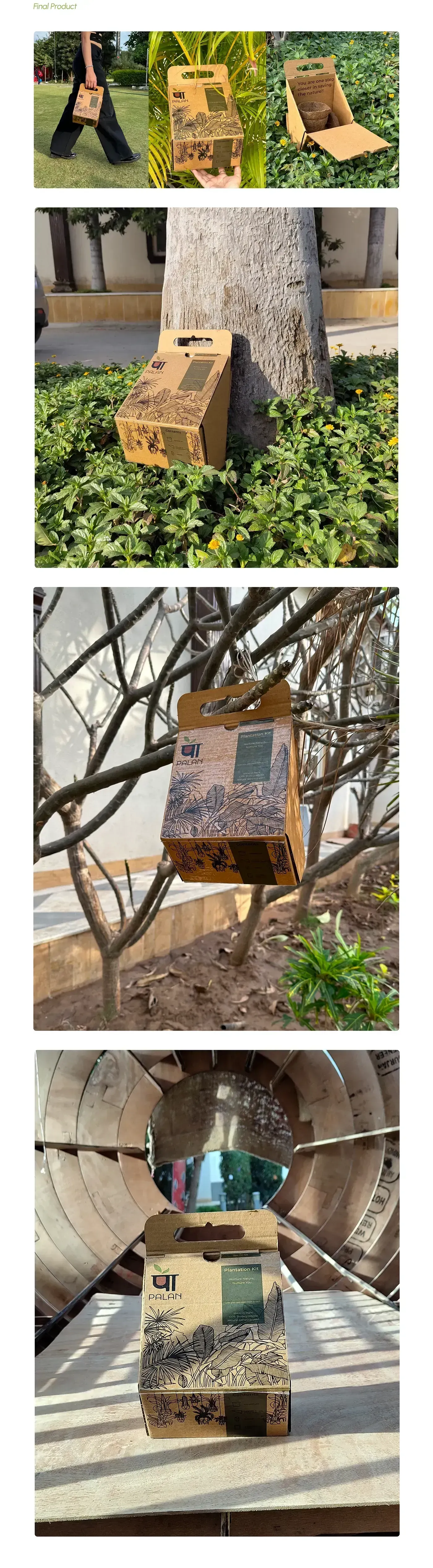
The package has to sell the product before anyone reads the details.
Open the complete Behance case study
The external project contains the full visual sequence, process images, renders, screens, and presentation boards.