Sailfish - Hyperloop Commuting app
A commuting app concept for a future mobility system, focused on route clarity, information hierarchy, and calm trip planning.
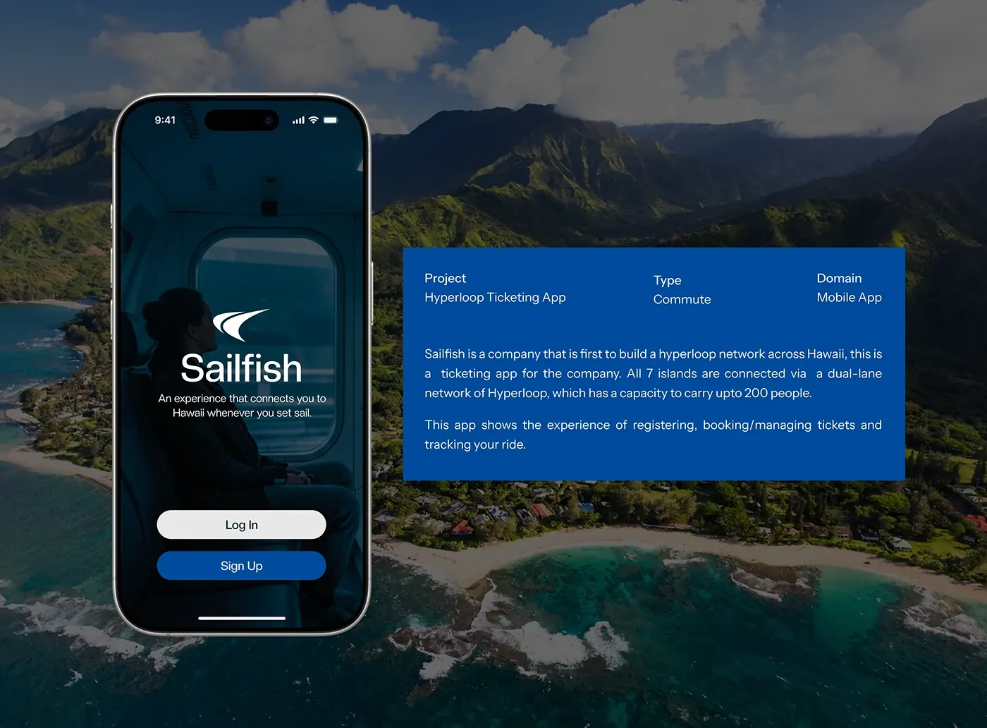
UX strategy, information architecture, UI design, prototype storytelling
A futuristic mobility system can easily become difficult to understand if the app overloads the user with novelty. The commuting flow needed to make route planning, timing, and trip confidence feel calm.
“For new mobility systems, trust comes from predictable information before visual excitement.”
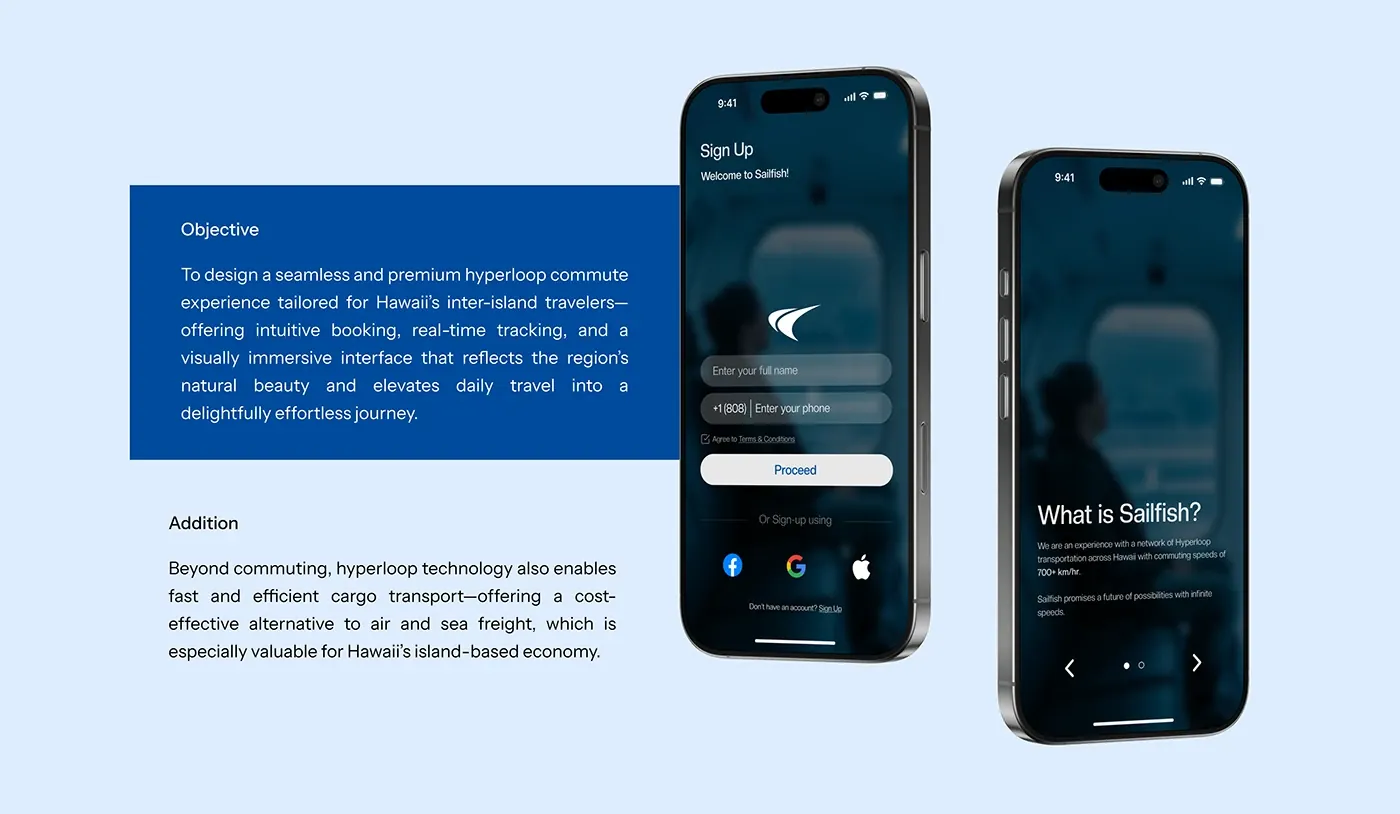
Mapped the commuter journey from planning to boarding to arrival with emphasis on time, route, and status clarity.
Designed interface hierarchy around the decisions a commuter needs to make quickly.
Built a calm visual system that makes a speculative transport experience feel usable and believable.
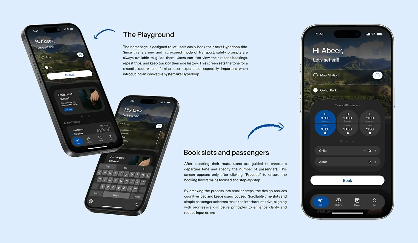
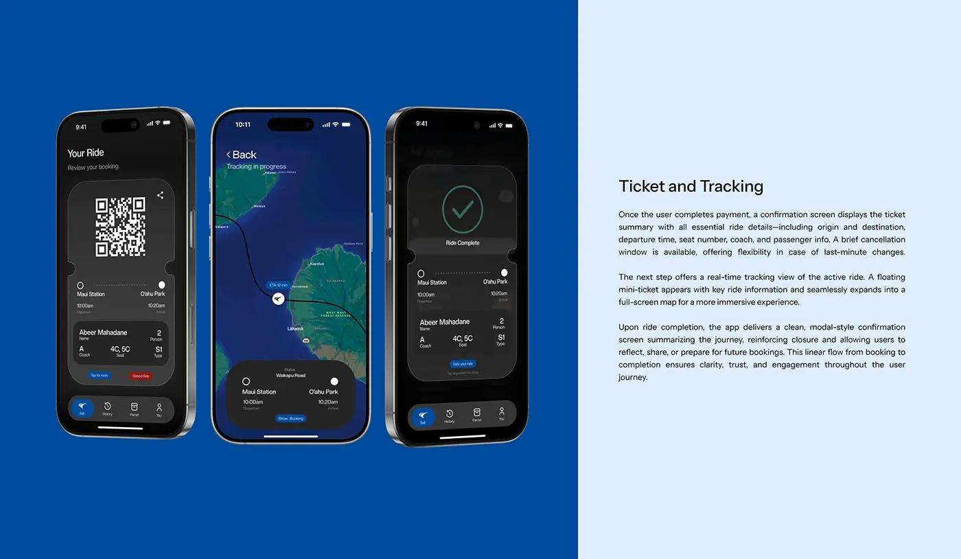
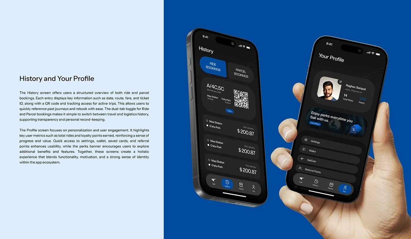
The UI keeps trip status, route logic, and timing visible at the right moments.
The visual system avoids unnecessary futurism so users can focus on the commute.
Screens were structured around what the commuter needs to understand next.
The future of mobility still has to answer one basic question: where do I go next?
Open the complete Behance case study
The external project contains the full visual sequence, process images, renders, screens, and presentation boards.